


Making progress
with a little help from my [Substack] friends

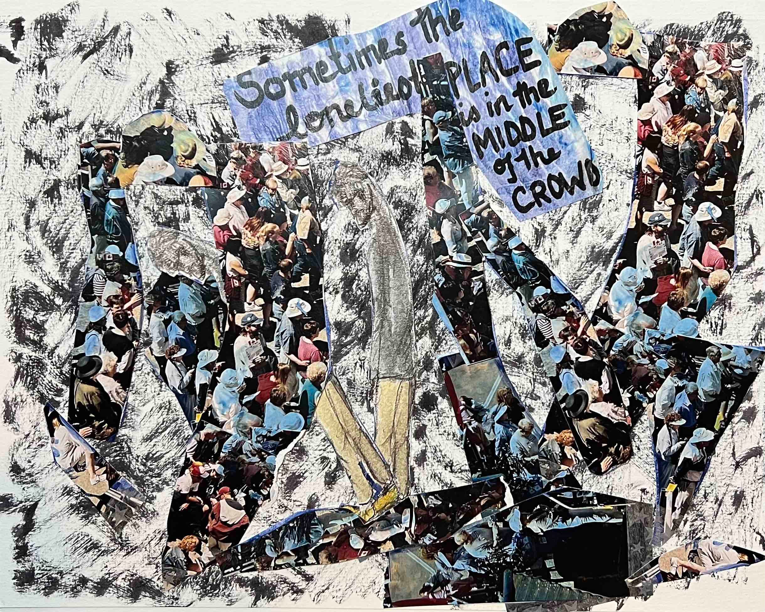
When I posted my last attempt at the ‘lonely in a crowd’ piece, I received some extremely helpful feedback from readers (thank you - this is why I am so enjoying this particular way of working on this project).
The blue background clearly had to go, but solid black seemed a bit too severe and, well, black and white, so I used a blank watercolour brush pen to add some dark texture to a fresh blank page.
While I was ruminating, I sent a photo of the original not great piece to the local printer and had several copies made. I cut two of them up and then layered the bits into this new version.
I much prefer the imagery (not a great photo - but it was hard to capture as the printer printed on semi-glossy photo paper… ) this time around - would love to hear your thoughts on the doppleganger.
The lettering isn’t right - and now looks even more out of place than in the original. However, I have not stuck all of this down too carefully, so I can swap that out tomorrow. Thoughts?
Overall, though, I think this is a step in the right direction, so I’m really glad I shared the earlier attempt because I don’t know that I would have got this far without that detour into ‘ewwww - not quite’ land.
Thanks for reading (subscribing, sharing, all that good stuff)! I’ll be back tomorrow, probably with yet another iteration.
I'll wait for tomorrow ... Love your progress and the commentary on the process of creating.
Wow I really like white black background for the crowd but I can’t see our hero well in this background, is it just me? As for the wording, I would try making use of the background space and distribute each word into those such that the order is from top to bottom and from left to right to direct the viewer on the order of words.