


Those hills of Galicia
and the perils of lettering...

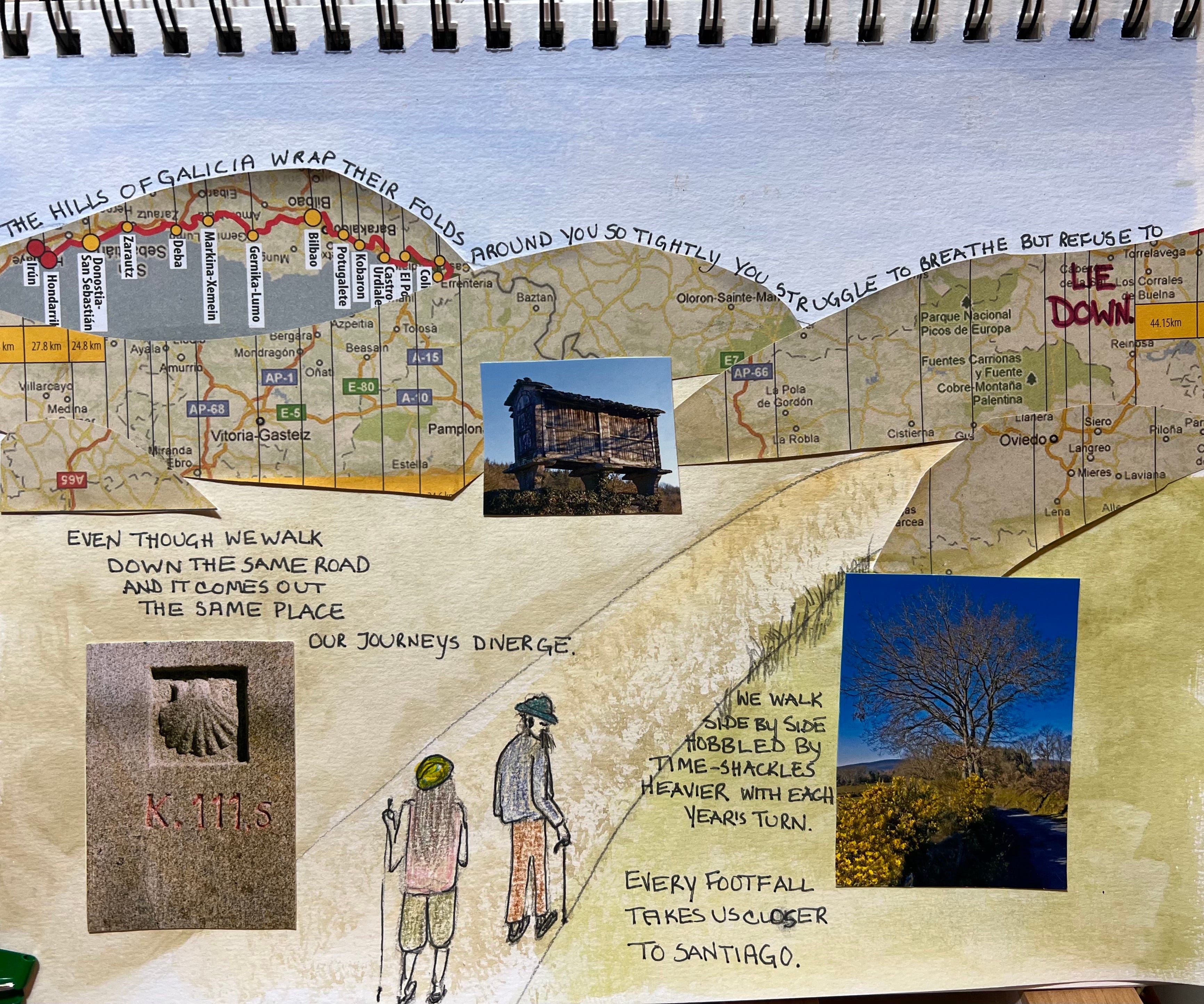
Yesterday I mentioned a) scads of ephemera and b) a poem that I wrote about Dad’s Camino in 2017 when he was already struggling to walk up a flight of stairs, never mind up and over the endless hills of Galicia in northern Spain.
This is only the first part of the poem (there’s about as much again to come) but weirdly (and doesn’t this just figure), the hardest part of today’s page wasn’t actually the little people (I could live with these guys) but everything else! The lettering, in particular, proved problematic - where to put everything if I wasn’t going to just, you know, write one line under the other like I normally would. What would happen if I followed the line of the hills (cut out of a Galician map from yesterday’s treasure hunting) for that line about the Galician hills? Note to self: plan this FIRST in pencil before just grabbing an ink pen because otherwise you will RUN OUT of ROOM!!
My first effort at ‘LIE DOWN’ was illegible, hence the red ink. Ah well, lesson learned on that front.
Also of interest (to me, anyway) was that the line about the hills isn’t actually the first line of the poem, but may well be read that way, given its location up there on the skyline.
Given that I can’t control the order in which people will read the page, if I’m going to include any more of this type of text it will have to be flexible in terms of sequencing but still make sense.
I’d love your feedback on the concept of mixing and matching text, collage, and drawing. I’ll take your notes into consideration and then plunge into the second half of the poem.
Thanks for reading!
Loving the journey…
In response to your query about collage and ‘irregular’ lettering, there is a big difference between being confronted with one page - a singular piece of art - versus navigating multiple pages, maintaining flow. Personally, I find it somewhat exhausting. I have seen other graphic memoir boldly experimenting with this and despite the cleverness, even the beauty, they end up being “unreadable” for the vast majority of their audience.
Used sparingly it might well be effective, but there is such a level of time, effort and commitment required for the reader that it risks being a barrier.
Perhaps if you are ‘drawn’ to creating more of these complicated pages, you might decide to treat them almost as a conventional illustration with an accompanying sparer text page bearing in mind that many readers will skip the words creatively layered into visual. This would allow readers to choose whether they want to “deep dive” or not while keeping them in the narrative.
(Another way at this would be to add the text later as a digital layer you can play around with … but then you lose the magic that arises through the moment by hand. )