


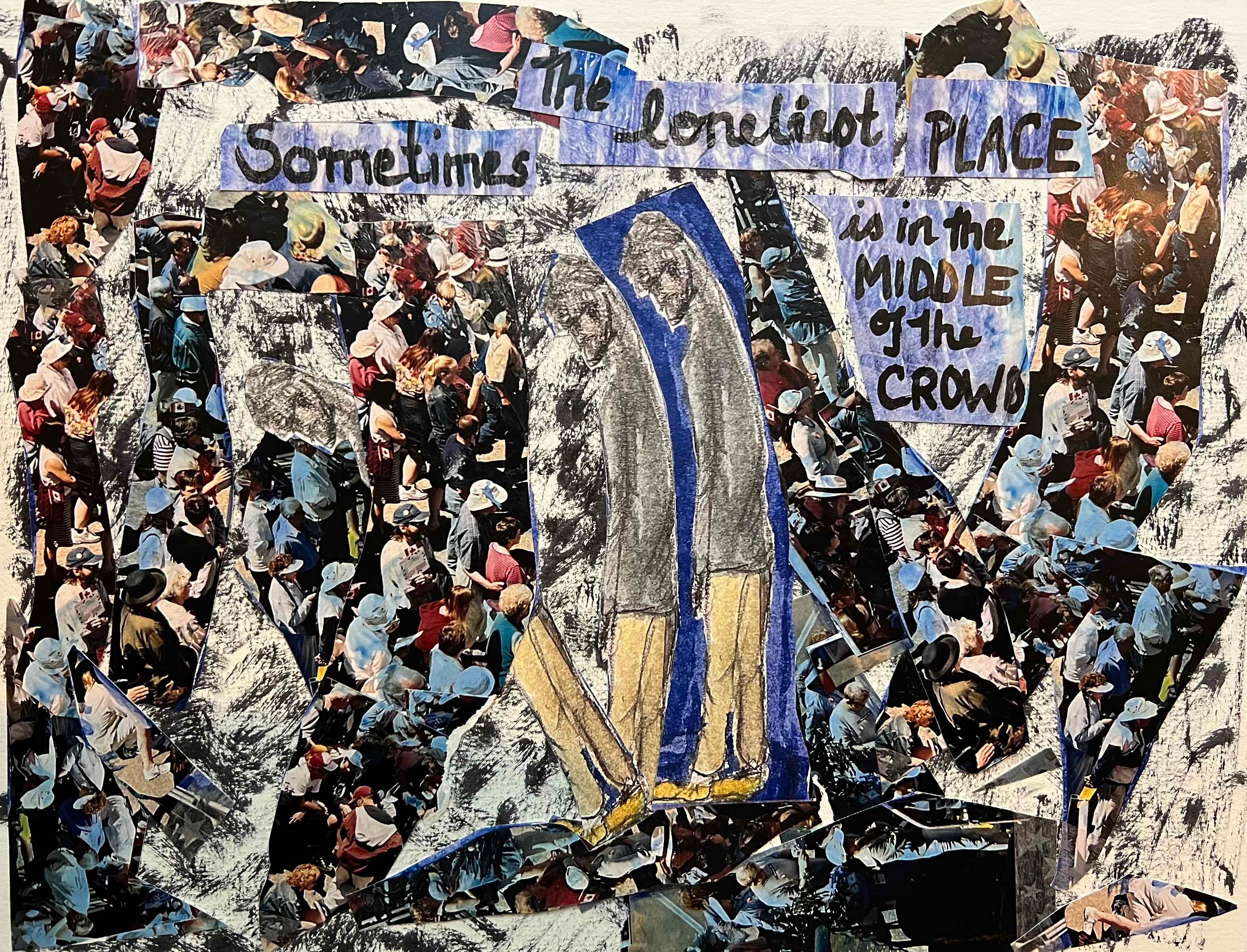
Third try's the charm?
Enter the man in blue consumed by the crowd

After some great back-and-forth discussion (here, on Facebook, by email), the following comments stuck out.
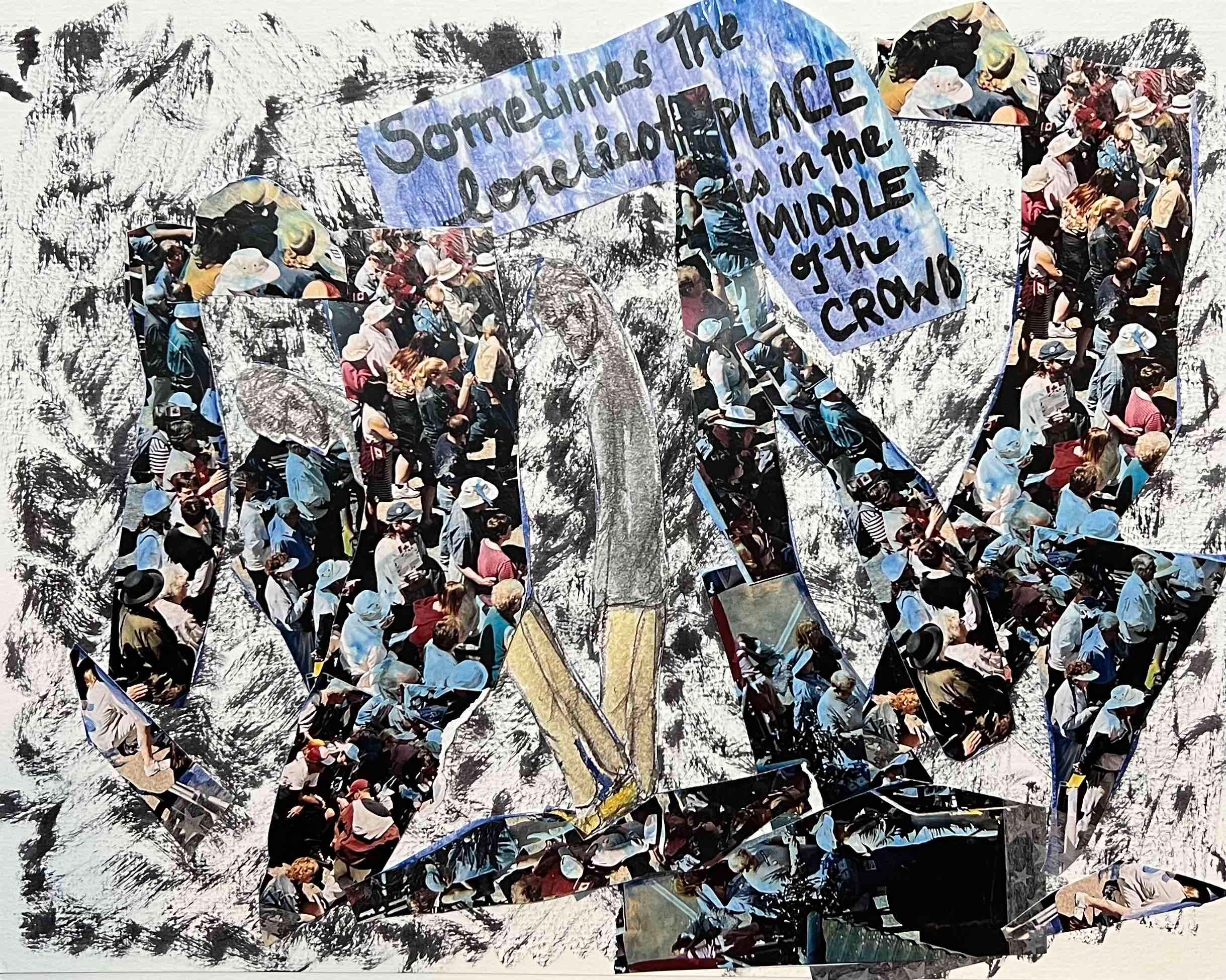
When we lost the blue halo around Lonely Man, we lost something we maybe didn’t need to lose.
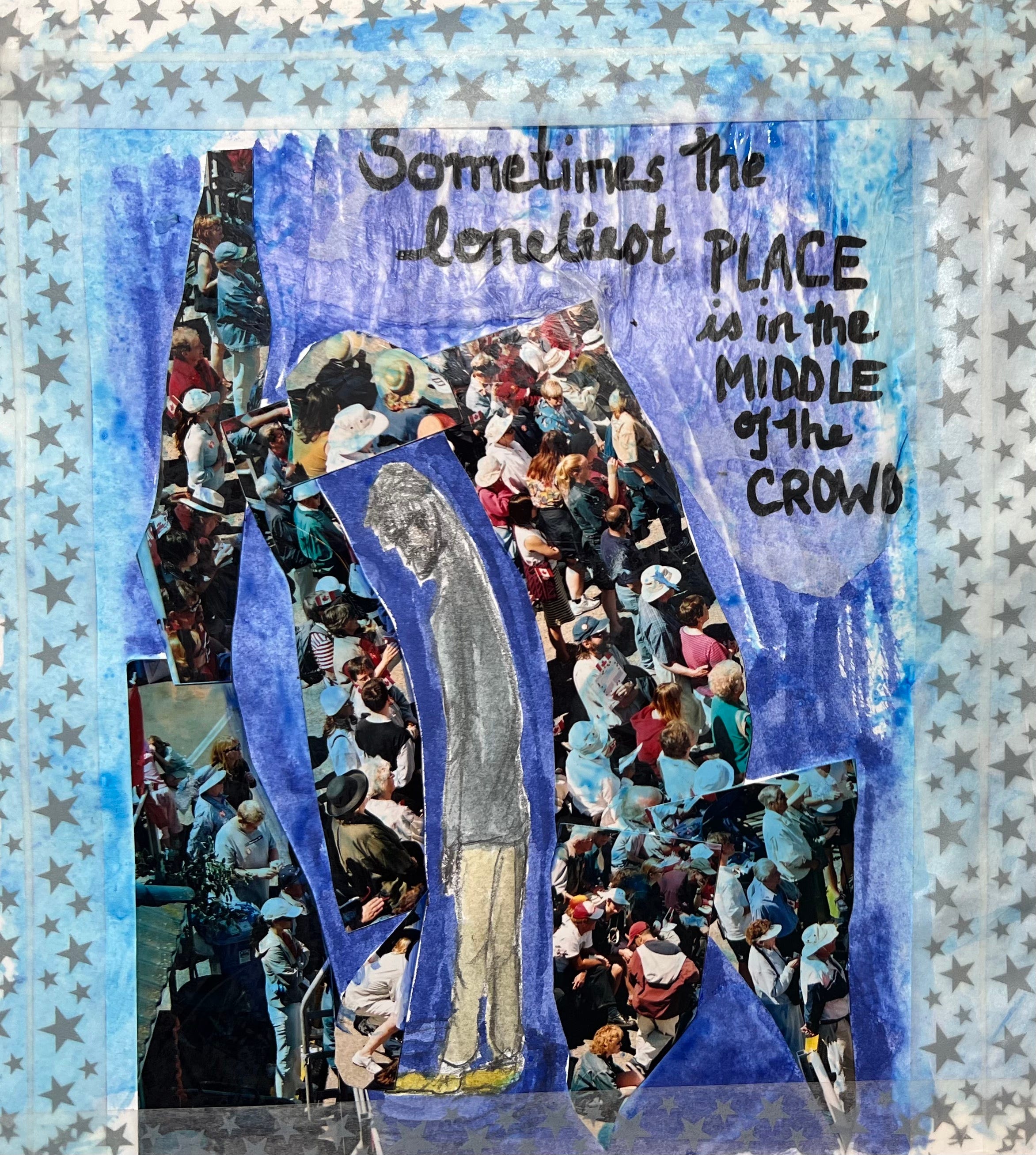
The second version (from yesterday) had the Lonely Man getting a bit lost with everything that was going on around him.
Re. the text - one suggestion was to break it up and have the words lead us through the image. I’m still not happy with this current iteration - but, moving in a better direction, I think. In general, more people like the content of the words than didn’t.
The decorative starry border wasn’t helpful. Agree. Got rid of that.
What I like best about this version is the way we now have three figures (Me, Myself, and I?) and the one to the left is being devoured/consumed/subsumed by the crowd. Now, I may be revealing a bit more of my innermost psyche here (if you don’t like that stuff, skip to the end… I’ll never know), but sometimes I feel this way in a big crowd.
At first, I enter the space as me - blue halo pretty much intact. But, then the crowd starts to feel bigger, more oppressive and I start to shrink, feel intimidated/less myself - until, finally, I have the feeling of being anonymous and invisible, as if my presence in the crowd is irrelevant. Nobody will miss me when I’m gone/not in the crowd any more.
If I were to try to analyze this piece, that’s where I’d go, I think.
And, for interest, here are the three iterations (so far) one after the other so you can see the development…

Ok, I’ll leave that for now… but I do wonder if I need the text there at all. Thinking aloud (this whole newsletter is me thinking aloud), but if you’d care to chime in, I’m loving your comments. (And, if you happen to be one of those amazing word/text artists, you’re probably thinking, ‘Just do XX.’ In this department, I don’t even know what I don’t know. There is probably an elegant solution, but I’m not seeing it — yet.)
Nikki, this looks so immersive and thought provoking. I think making this lonely character highlighted has created a sharp contrast that conveys the message. I also love how you distributed the crowd to a larger area rather than just around the character, that also contributed to the contrast. As for your comment “but I do wonder if I need the text there at all”, now I am wondering the same... All along, you had this text as a title or context for this piece, at this point it is just a matter of how you want to lead the viewer. Do you want them to think, get consumed, and arrive at the same place as you without super clear instructions? Or do you want them to be directed very strictly and clearly to where this is headed to? Thank you, again, for sharing this process. I enjoy seeing the process, reading the comments and suggestions, and observe how others’ interpretation shapes the process. Thank you!!