


That went sideways
in a lonely wash of blue

Sometimes, an ok idea (I think it was an ok idea - tell me what you think by the time you get to the end of this message…) goes sideways and doesn’t work out at all as planned.
Here’s what I was thinking when I sat down to start this project.
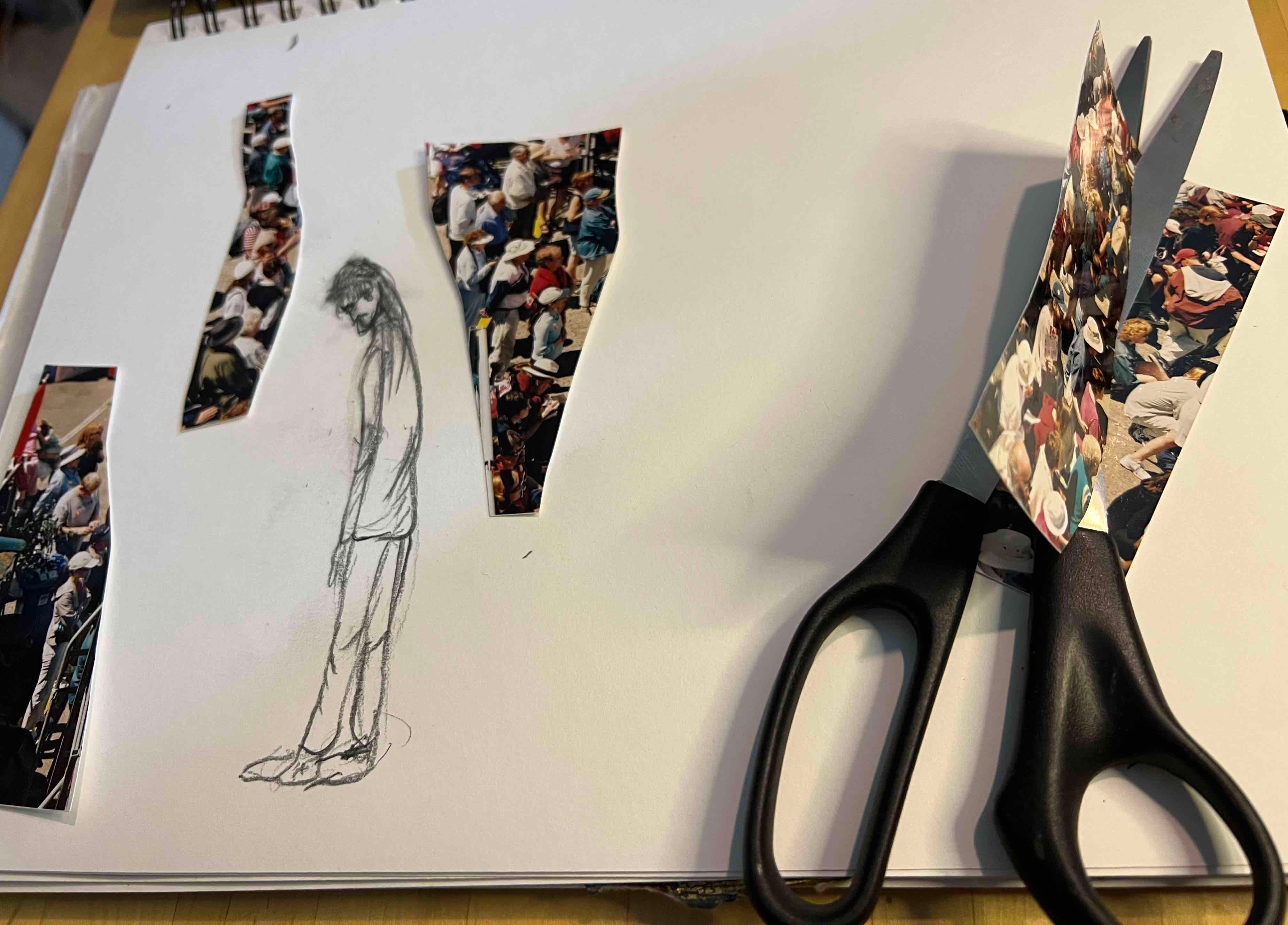
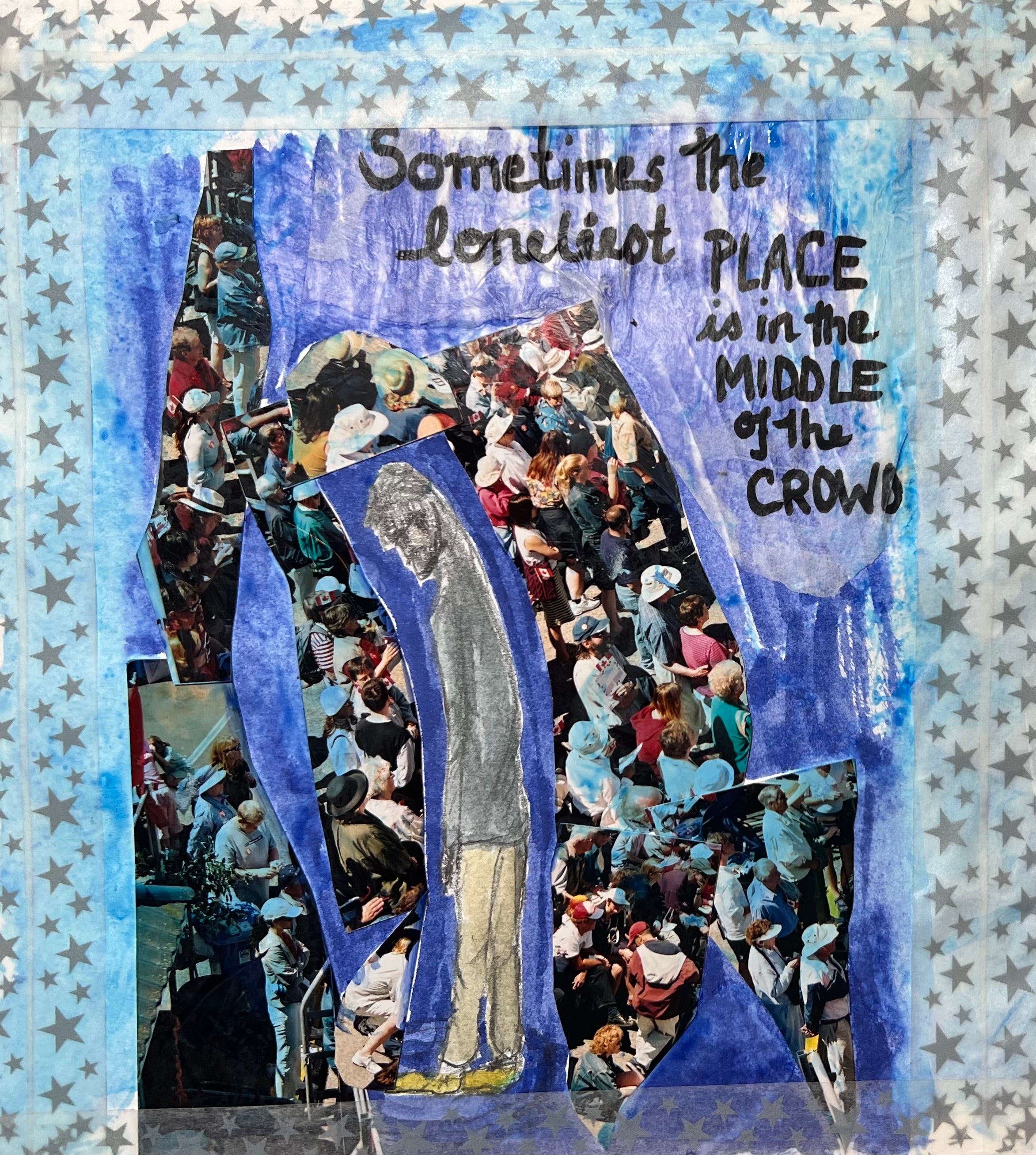
First, I had such a blast yesterday at the photo modification workshop (see yesterday’s post) I decided to try another project, this time starting with a photo of a crowd taken many years ago. It was a nothing-special kind of shot so it seemed perfect to try to find a reason for it to stay out of the recycling bin.
As I was thinking about crowds, I thought about how odd it is to sometimes feel like you are the only one swimming upstream when everyone else is headed somewhere else… Or, how it is possible to feel totally alone when surrounded by other people. Sometimes that’s fine - it’s kind of cool to be an invisible observer in a sea of humanity. At other times, though, being surrounded by people who all seem to have a purpose and that purpose isn’t yours can leave you feeling isolated and terribly lonely (or, maybe that’s just me).
To try to capture that experience, I drew a figure, slightly stooped and facing in the opposite direction to all the people in the crowd scene. I used a heavy, thick pencil because I wanted to contrast all the colour of the crowd with the lonely person done in shades of grey. In the end, I settled on muted colours for the person.
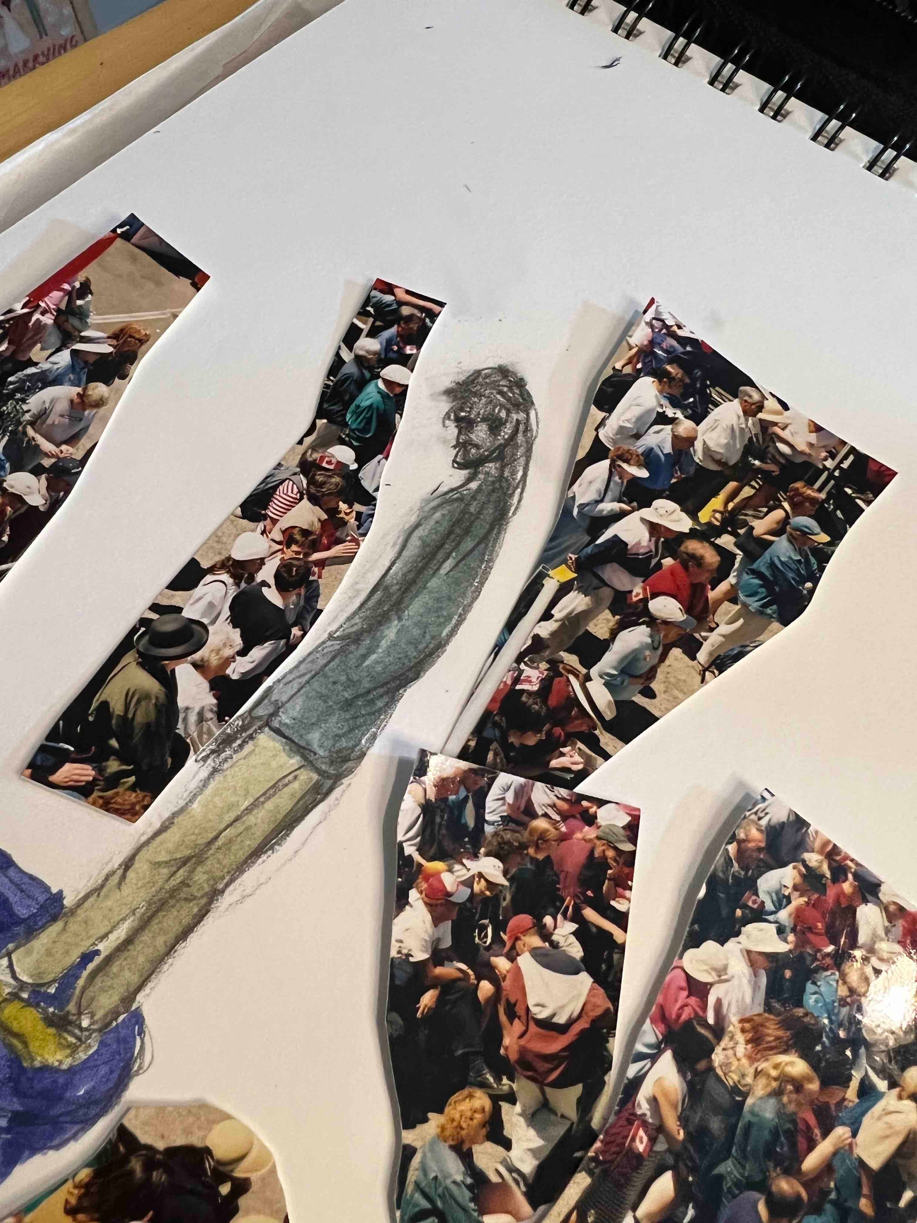
Cutting up the photo, I tried to mirror the shape of the person with the angles and shallow curves of the cut lines. I fiddled around with placement and wound up having the lonely person sort of hemmed in by the crowd but clearly separate. I glued everything down and took another look.
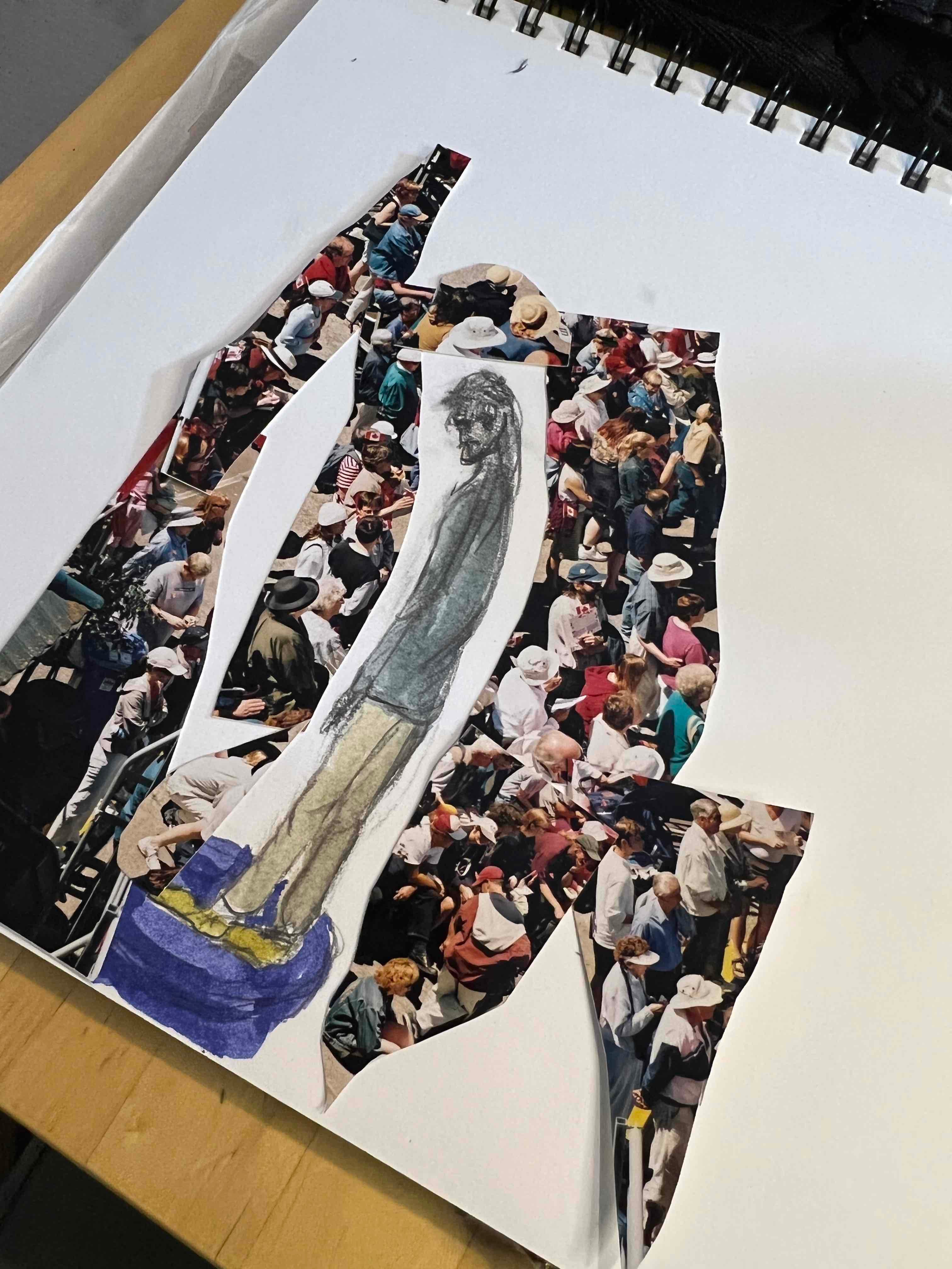
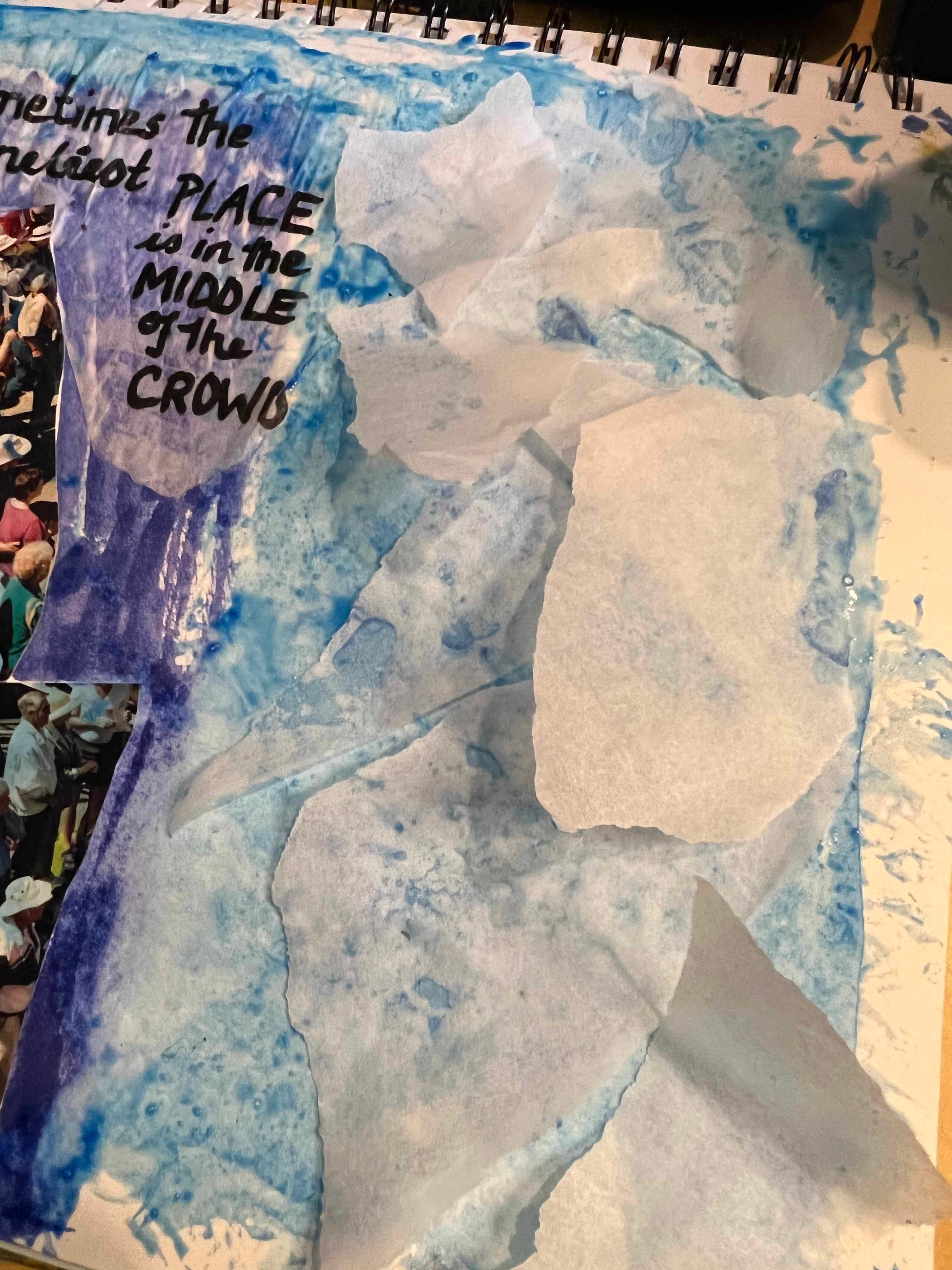
I didn’t like all the white, which is where things started to go wrong.
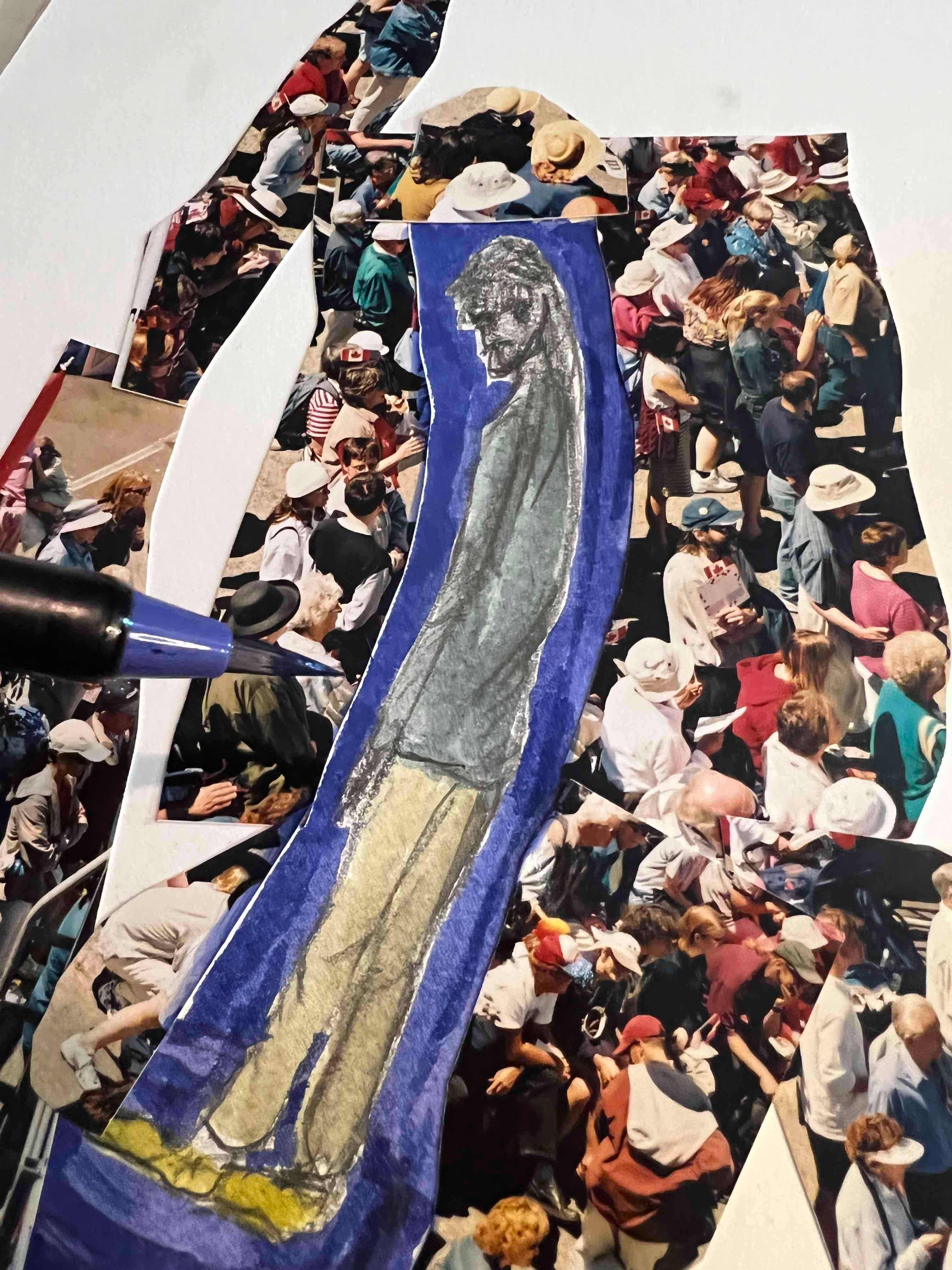
Perhaps if I’d left it here it might have been ok, but no… I kept going with the blue brush pen until…
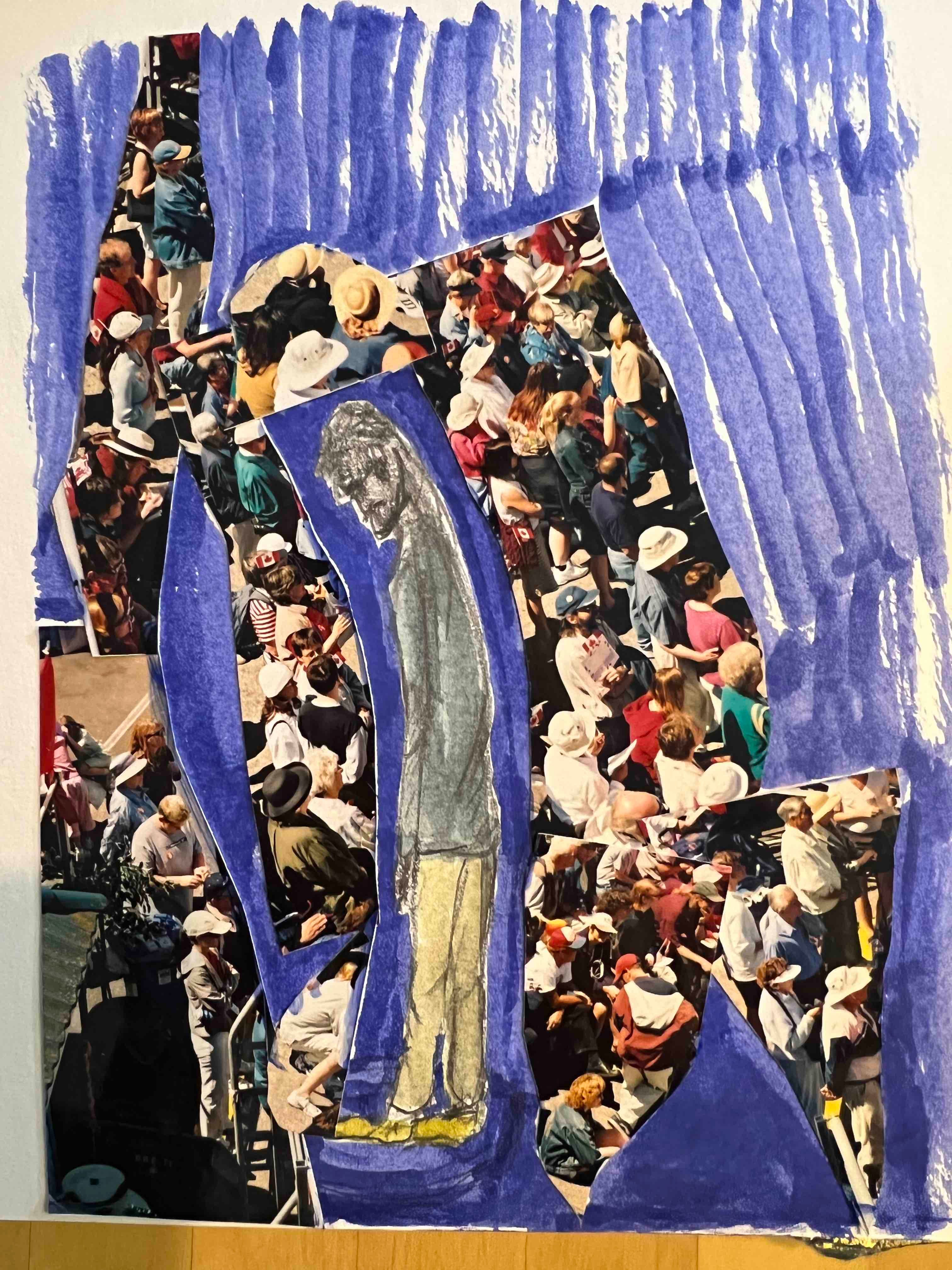
… there was a lot of blue and the crowd was losing a bit of its edge. The lonely person was also getting lost, which wasn’t really the message I was trying to capture.
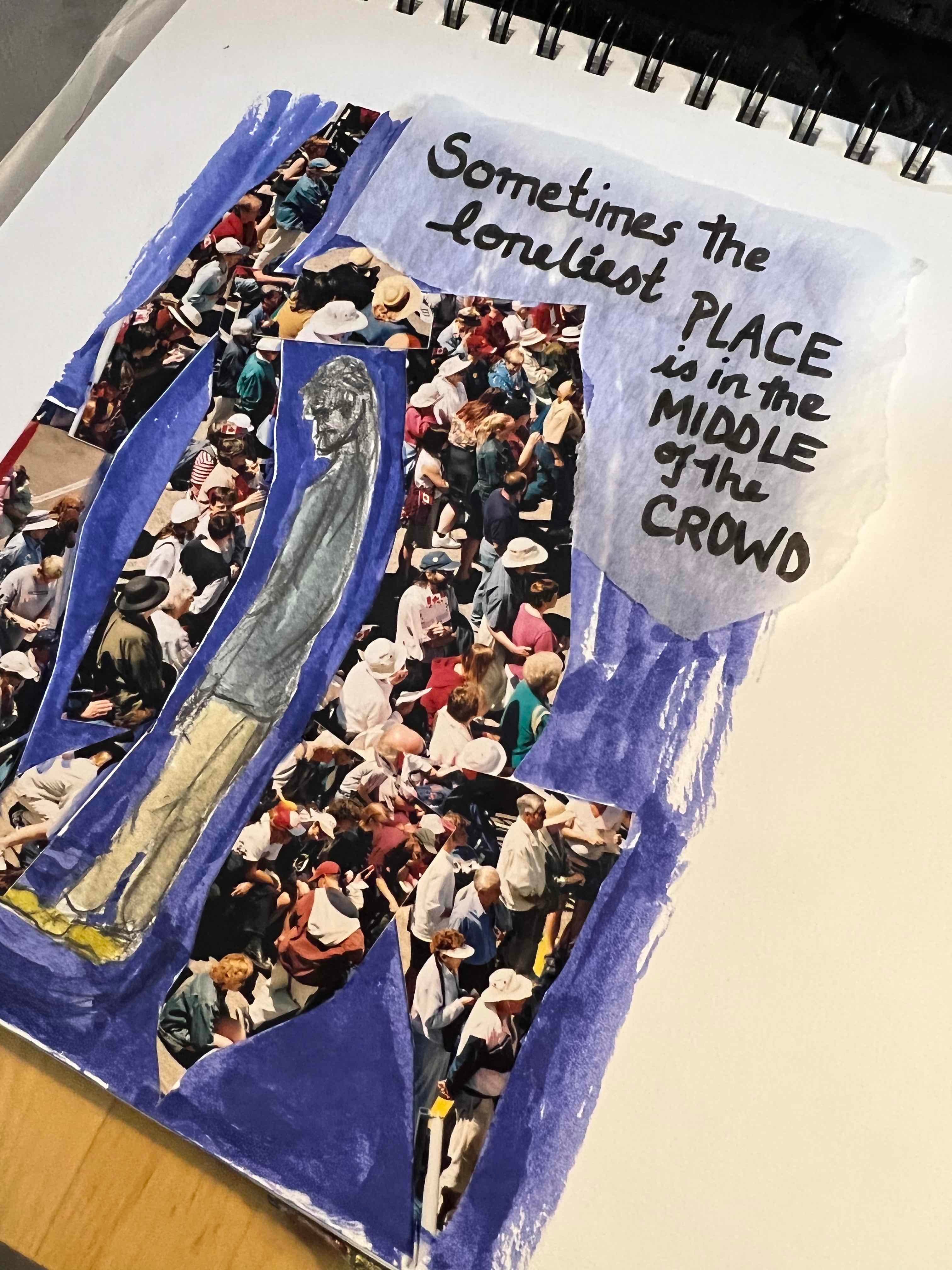
From here I decided to try adding text by using a brush pen on tracing paper and then layering that on top of the blue stripey bit, sticking it all down with ModPodge (which turns the tracing paper sort of see-through). In this next photo the tracing paper is lying on top of the page but has not yet been glued down.
Here’s a warning to anyone out there who likes to take their chances with random art supplies found in bins at the thrift store. TEST FIRST! And, not on the actual page on which you are considering using said random art supply.
Case in point.
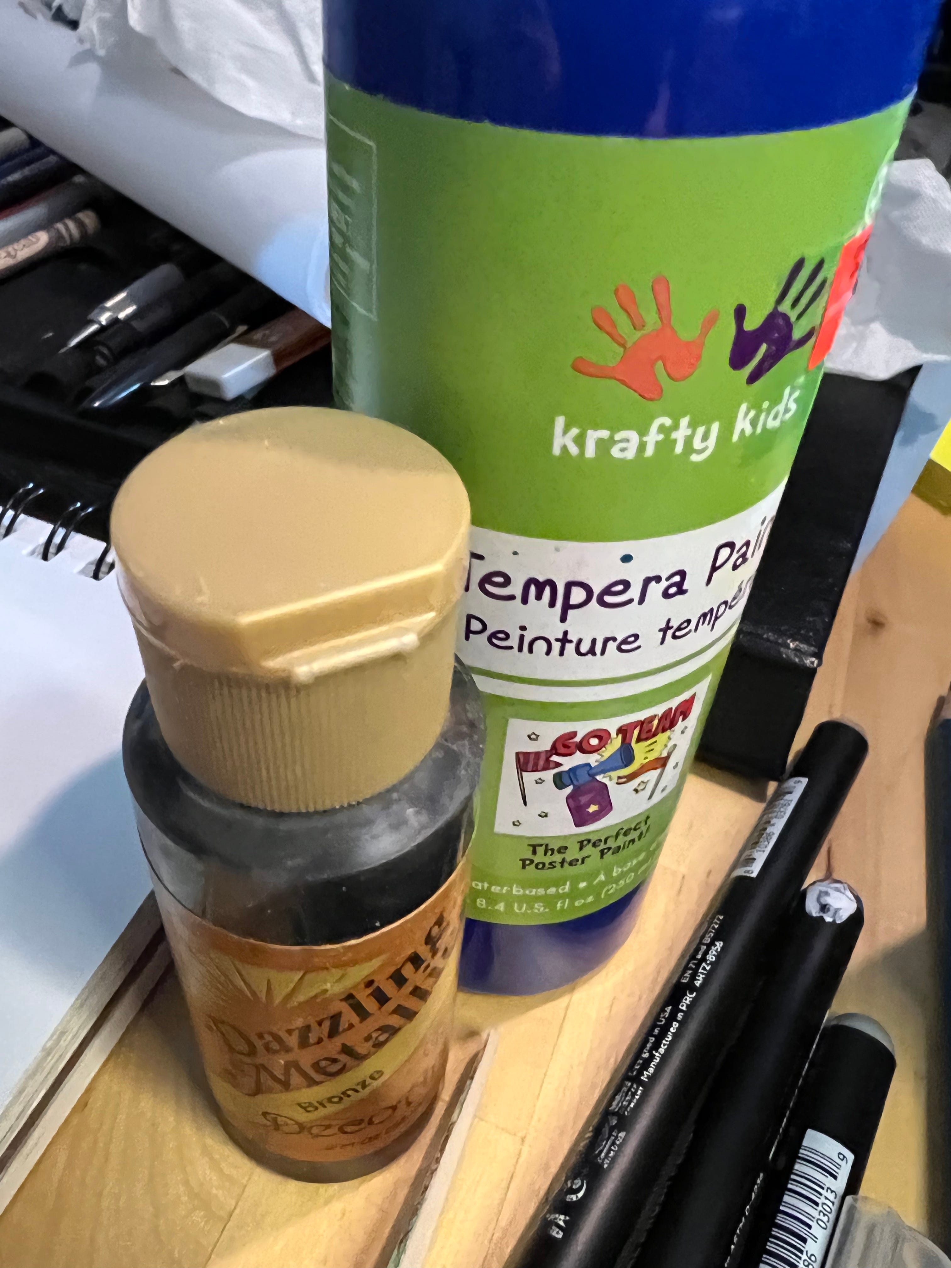
This Dazzling Metallic Bronze paint-of-some-sort looked enticing. I thought it might work well to create some kind of frame-effect. I shook well (following the faded package instructions) and squirted some to the right of what I’d done to this point.
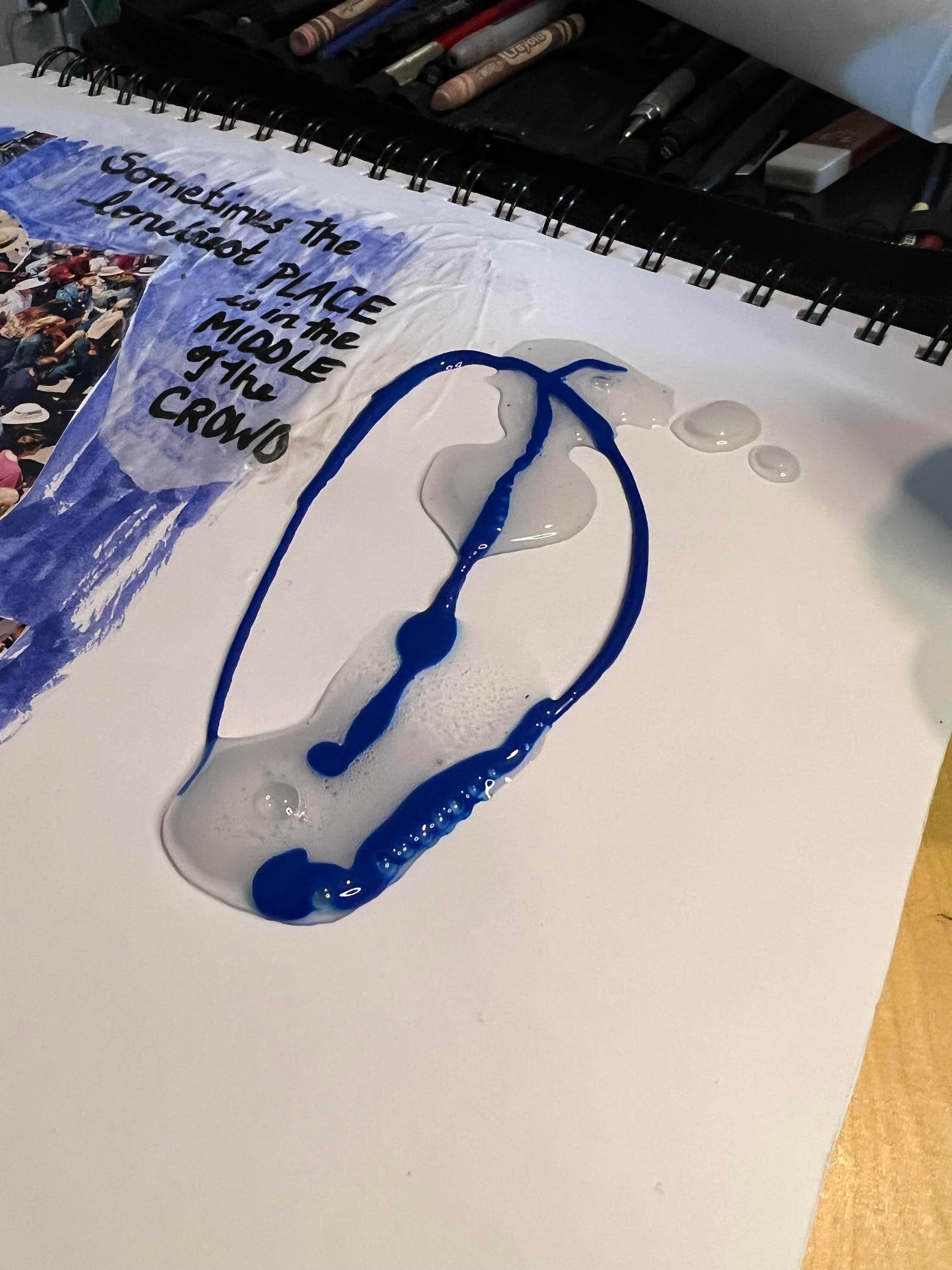
The result was not bronze or dazzling. The weird goopy slime that came out was not helped by the addition of blue Tempera Paint. I have a bit of video of me smoodging all that together with a palette knife… As you can imagine, a mess was the result.
… so I tried to dab off the thick of it by using paper towel and then cover up the residue with more bits of torn tracing paper. I glued that down, added some washi tape around the edges to try to further disguise the blue disaster and tidy things up a bit and got this:
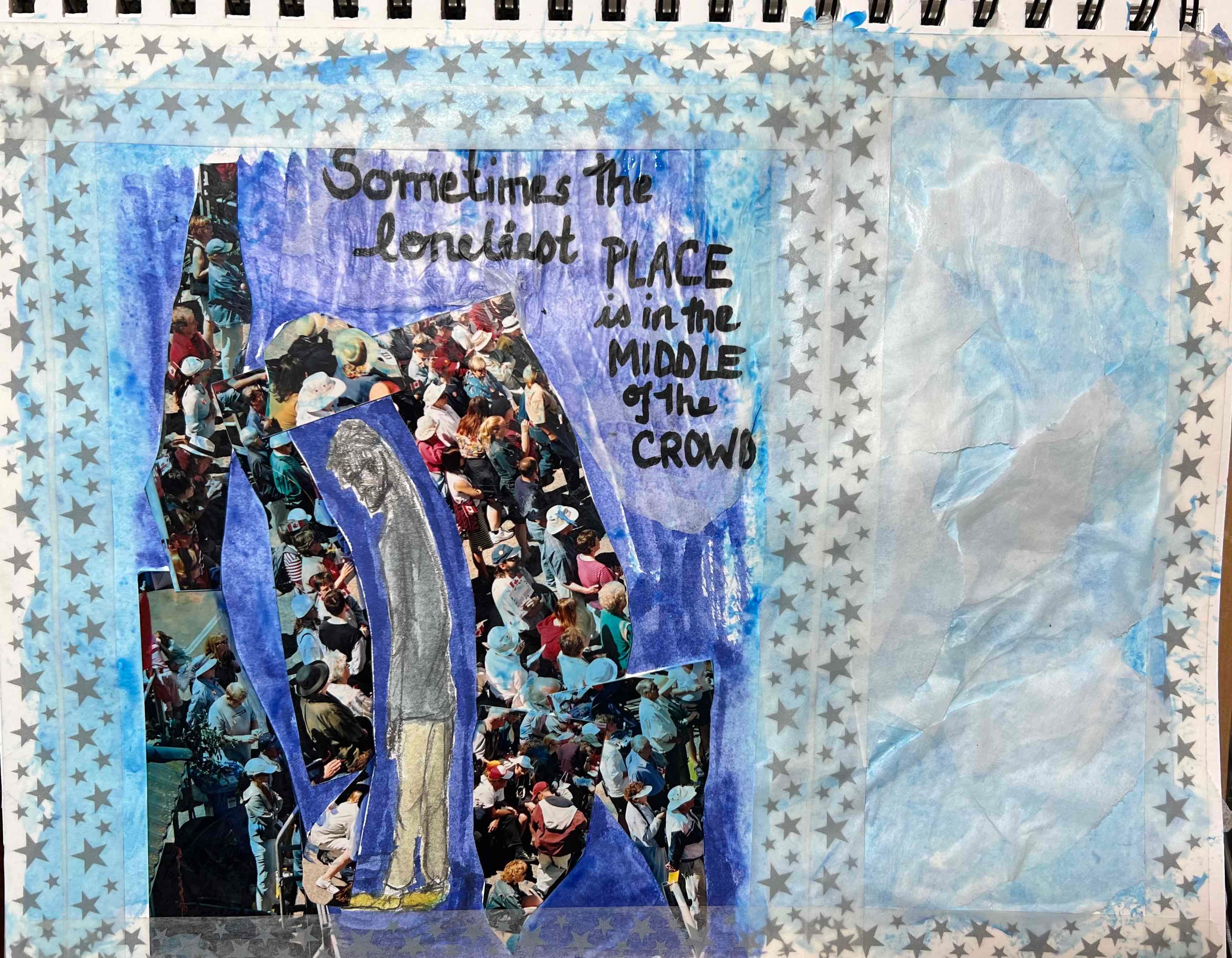
This now either needs something (a suitable bit of text? a poem? an uplifting/hopeful image to contrast with the lonely dude in Blueland over on the left) or…
… or, maybe it’s better to cut off the righthand side, call this Dude in Blueland and move on. It can stay buried in the sketchbook as an experiment that didn’t wind up going anywhere much.
Thoughts? Keep going? Try again tomorrow? What would you put over on the right if you were to keep the panel on the right?
When I write (and, for that matter, when I read) I like my story endings to be satisfying. Better yet, there should be a sense of resolution or redemption. Today’s adventure in collage doesn’t feel like it ticks any of those boxes… I’ll let you know if I have another crack at this tomorrow. Sometimes, sleeping on a problem results in a flash of inspiration. I can only hope…
Completely untrained and unartistic opinions: I love the concept. Blue’s shade (or tone?) doesn’t fit, maybe Black would emphasize the “lonely guy” and the crowd contrast? I love the text, works great with the opposites. Right side feels empty? Useless? Want to write a poem over there? Or just call it a deal and cut it off? In any case, I love seeing how certain processes move forward and how sometimes what we had in mind doesn’t pan out well and we still figure out how to move on with or from it! Thank you for sharing!
Ok straight to constructive criticism as invited:
Art … and craft. Perhaps you might consider to strip it back to the strong layer that does work - literally cut off the craft edges (or block them out) and go back to the art. Sit with that feeling. Have you considered a black background? Or very dark blackened shade pulled from the crowd pic… to enhance the isolation and blue mood/aura of bent figure. The words work, but I’m not sure the light colour blue/lilac shading does…a little cheerful, ethereal? … maybe even slightly greyed would convey better the starkness of message? Instead of cutting out the central piece of art, you could superimpose black ‘framing’ - see what you think. More importantly, feel what you see. That state, I believe, is the defining difference between art and craft. In this journey you are trying to do both at the same time (develop the craft as well as express yourself through art). Your quick clarity in this piece is wonderful insight… interested to know what arises after sleeping on it!